The AQI and Wildfire Smoke: What You Need to Know

By Rachel M. Shaffer and Annie Doubleday 

Disclaimer: The views expressed in this post are those of the authors and not their employers.

“What does the AQI really mean?!”

That was the essence of many questions from friends and family trying to navigate personal decision-making and risk calculations during the recent (and ongoing) unprecedented smoke episode affecting the east coast and midwest of the United States.

As environmental epidemiologists with expertise in air pollution, we have both thought about this question in relation to our research as well as on a personal level from living through multiple difficult wildfire seasons in the Pacific Northwest.

Introduction to the AQI

The Air Quality Index (AQI) is, just as the name implies, an index to report air quality and is used as a public health tool for communicating risk due to air pollution. 

Below is the basic version of the AQI table, with color coded categories and levels of concern corresponding to each numerical range of AQI values. 

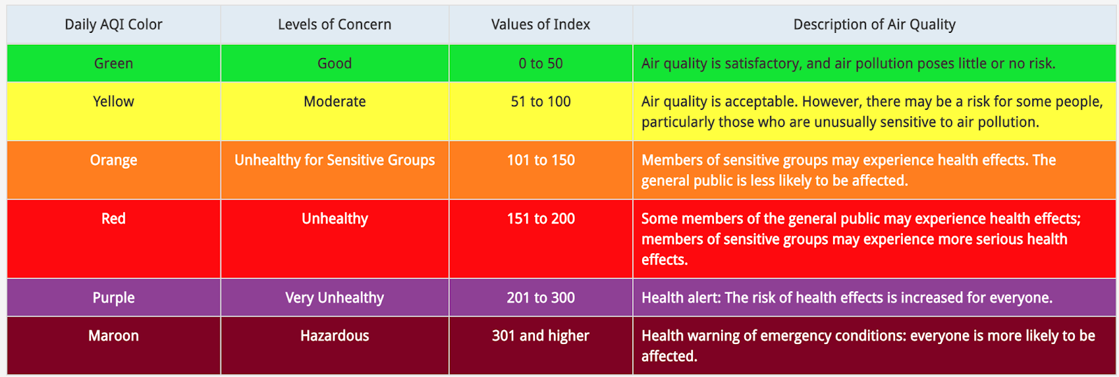
https://www.airnow.gov/aqi/aqi-basics/

EPA actually develops a specific AQI table for five of the “criteria pollutants” regulated under the Clean Air Act: ozone, particulate matter (PM2.5 & PM10), carbon monoxide, sulfur dioxide, and nitrogen dioxide (see pp. 4-5 in this technical assistance document for a master AQI table for all of these pollutants). The overall AQI for a given day is determined by the pollutant with the highest concentration (usually PM2.5 or ozone). 

The Meaning Behind the AQI

But how are these generic index values (e.g., 0-50, 51-100) linked to air pollutant levels? 

Let’s explore this question in the context of the AQI for PM2.5, the most relevant index to consider for wildfire smoke. 

AQI CategoryValue of Index24-hr PM2.5 (µg/m3)Rationale for Upper Bound
Good0-500-12.0Current annual average National Ambient Air Quality Standard (NAAQS) for PM2.5
Moderate51-10012.1-35.4Current 24-hr average NAAQS for PM2.5
Unhealthy for Sensitive Groups101-15035.5-55.4“…the health effects evidence indicates that the level of 55 µg/m3 …is appropriate to use” (2013 Federal Register Notice)
Unhealthy151-20055.5-150.4
Linear extrapolation approach, assuming that increased PM2.5 concentrations are associated with greater proportions of the population affected
Very Unhealthy201-300150.5-250.4
Hazardous>300>250.4

The AQI cut-point of 50 (defining the upper end of the “Good” category) corresponds to an average PM2.5 concentration of 12.0 µg/m3 over a 24-hr period, the current National Ambient Air Quality Standard (NAAQS) for annual average exposure to PM2.5. (EPA has a structured process to revisit the NAAQS (approximately every 5 years), and these associated AQI cut-points get updated each time the standards are updated.)  

The AQI cut-point of 100 (defining the upper end of the “Moderate” category) corresponds to 35 µg/m3, the current 24-hr average NAAQS for PM2.5

As for the next category? Well, here’s where it gets hazier. The 2013 Federal Register notice (published for the last AQI updates) does not provide clear information on how the 55 µg/m3 cutpoint (the upper end of the “Unhealthy for Sensitive Groups” category) was determined. The explanation is simply that “the health effects evidence indicates that the level of 55 µg/m3… is appropriate to use.” 

And what about the cut-points for the higher categories? These are also not linked to any specific health effects evidence but instead determined by a linear extrapolation approach, with the assumption that increased PM2.5 concentrations are associated with greater proportions of the population affected. 

The bottom line: the lower levels of the AQI are closely linked to national air quality standards and associated scientific research, but there is more uncertainty about the evidence used to set the upper levels.

Be cautious with the AQI

The AQI is the best approach that we currently have for quickly communicating information about air pollution risk to the general public. However, to be an informed “user” of this information (in essence, to calibrate your individual actions in relation to your own risk), it is important to understand the uncertainties and limitations in the index.

  1. Differing composition of wildfire smoke PM2.5 vs. ambient PM2.5

The research used to set the NAAQS for PM2.5 – and correspondingly the AQI, as described above –  is primarily based on ambient PM2.5 (usually from traffic, urban, or industrial sources), which has been the focus of extensive research for the past several decades. However, there is growing evidence that wildfire-associated PM2.5 is different from industrial/traffic-related PM2.5. For example, research to date indicates that wildfire-associated PM2.5 contains more toxic metals and is overall potentially more toxic to human health. This suggests that using an AQI based on ambient PM2.5 to understand risk from wildfire PM2.5 could lead to some uncertainties in estimating risks. 

  1. Uncertainties about the relevant exposure period

An important consideration in thinking about how an environmental exposure, like wildfire smoke, affects human health is to figure out which “exposure metric” is most relevant. For example, is it:

  • peak exposure (e.g., a one-time, very high exposure that pushes your body over a threshold to initiate a cascade of adversity)? 
  • average exposure? 
  • cumulative exposure (i.e., over a lifetime)?   

The AQI is based on 24-hr average pollutant concentrations, so the implicit assumption is that average daily exposure is a good metric for understanding/predicting health impacts. Most studies on wildfire smoke exposure have focused on 24-hour exposure or cumulative exposure over 2-7 days. We don’t yet have a complete picture on how peak exposure or cumulative exposure over a lifetime might affect health outcomes. So, if you are making decisions based on the AQI, remember that this index is focused on short term exposures and short term outcomes. 

  1. A single pollutant index in a multi-pollutant world

Each individual pollutant’s AQI only considers potential health effects linked to that single pollutant. And each day’s overall AQI is only based on the highest overall single pollutant AQI. For example, if the AQIs for ozone, PM2.5, and carbon monoxide are 126, 102, and 90, respectively, the overall AQI for the day will be 126. In the case of wildfire smoke, the AQI is based on PM2.5 alone rather than the associated toxic gasses. This ignores the potential additive or synergistic effects of exposure to multiple air pollutants at high levels over a single 24-hr period. 

  1. No clear “safe” level of exposure

The more we learn about PM2.5, the more we realize that there might not be a clear “safe” level of exposure. This idea was described in the 2013 FR notice: “the epidemiological evidence upon which these [divisions] are based provides no evidence of discernible thresholds, below which effects do not occur in either sensitive groups or in the general population.”

The AQI paints a slightly different picture. For example, the index indicates that this 24-hr average PM2.5 of 35-55 µg/m3 is only concerning for “sensitive groups.” Based on this guidance, the general population is not likely to make behavior changes in this range. However, evidence indicates population-wide impacts at and below these exposure ranges. In fact, an analysis of New York hospitalization data indicated that most excess hospital admissions occurred when the AQI was <100 (35-55 µg/m3). 

Of course, getting PM2.5 down to zero is an infeasible goal from a regulatory perspective, and public health guidance is based on a combination of science and practicality. But with the growing understanding of PM2.5’s acute or chronic effects on almost every organ system at even very low levels of exposure, we recommend taking steps to reduce exposure even at lower levels of the AQI.  

So, what does this all mean?

The AQI, like any other public health index or set of recommendations, has to distill complex information down to relatively simple forms and be able to make general recommendations despite real uncertainties and nuances (we saw this with public health messaging around COVID-19, also). 

No index will be complete or perfect. But to be able to use them effectively/appropriately, it is important to understand some of their details and uncertainties (as we’ve described above). 

In the case of wildfire smoke pollution, the AQI provides a good starting point to guide individual actions. However, it is important to listen to your body, pay attention to any symptoms, and consider reducing personal exposure to wildfire smoke even if the AQI category doesn’t officially suggest modifying behavior. Similarly, given the uncertainties regarding particulate composition, potential chronic effects from repeated exposure, mixture effects, and effects from low level exposure, we suggest interpreting the index cautiously. In other words, taking steps to reduce exposure to wildfire smoke is always better! 

In the coming years, we hope that emerging research on wildfire smoke can inform updates to the index to better guide appropriate individual actions. Given the growing risk of fires in a changing climate, we will all need to learn how to live with – and protect ourselves – from wildfire smoke. 

Why I Changed my Mind about Systematic Evidence Maps (+ 2 new publications)

The goal of most environmental health research is to understand how a specific exposure impacts human health. In essence, the focus is on discovery.

The goal of risk assessment, however, is to use existing data to quantify population risk from exposures, with the aim of informing policy and regulations. Here, the focus is on evaluation and synthesis of the published research.

Over the last decade, systematic review has been gaining traction in the environmental health field as a way to transparently and objectively evaluate and synthesize evidence across multiple studies on a particular question (e.g., is there a link between developmental exposure to PFOA and fetal growth?).

But, because systematic review is focused on a specific research question, it is actually too narrow to inform the early stages of chemical assessments and evaluations – which often need to start by broadly scoping the entire evidence base before prioritizing topics for in-depth analyses.

A (relatively) new approach: Systematic Evidence Maps

A more useful tool for this context is a systematic evidence map (SEM). SEMs utilize the same systematic and transparent structure as systematic reviews, but they have a broader (and more neutral) goal: to characterize the entire evidence base for a certain topic and map the features of the data through visualization tools (e.g., Tableau). In contrast to systematic reviews, SEMs do not draw any conclusions.

Example SEM from The PFAS Tox Database

When I first joined the EPA’s Integrated Risk Information System (IRIS) program, everyone seemed to be working on SEMs (since they are now often part of the IRIS assessment development process). Coming from my training in academia, I was not particularly excited about these “descriptive” products. The focus on tallying features of the evidence base (“X” number of epidemiological studies on developmental outcomes, “Y” number of experimental studies on developmental outcomes, etc) seemed pretty dull, to be honest.

But after almost two years into my job here, I’ve definitely come to see their value.

SEMs, like many other steps in the chemical assessment process (e.g., study evaluation, data extraction, etc), are not at all sexy. But they can substantially increase the transparency, efficiency, and credibility of assessments. (And that’s the goal, right – more trustworthy assessments? Yes, indeed.)

The benefits of SEMs

You can think about SEMs as very detailed scoping outlines developed from structured literature searches. By looking at an (often) interactive SEM (here’s one recently published for naphthalene), we can quickly identify data gaps, decide whether a new or updated assessment is needed, and/or refine the assessment priorities. This process ultimately saves us time and ensures that our assessments focus on topics with enough evidence to draw conclusions. (Of course, lack of data does not mean lack of risk, but we can’t develop robust assessments on topics with minimal data.)

The National Academy of Sciences, Engineering, and Medicine (NASEM) has also highlighted that SEMs could be valuable in themselves as publicly accessible databases of all of the research on a certain topic. (Check out this great one on PFAS from a few years ago!). Community groups, NGOs, and local, state, or federal agencies could use a published SEM as a starting point for their own particular goals and needs.

Advancing coordination

The idea that one group’s work to develop an SEM could be used as a starting point for another group’s projects is very exciting to me. It sounds so simple, but there is just not enough data sharing in the environmental health field. Sharing SEM content, which is broad enough to support downstream work in a variety of different contexts, could save a lot of time and resources.

This type of coordination is something that I’ve thought a lot about since publishing an infographic depicting the existing – and very complex – landscape for chemical evaluations and assessments. There’s no need to re-create the wheel for each assessment if we can start from a common and trusted SEM. Then, each program could take that body of work and use it for their particular statutory needs.

To further support this type of collaboration and coordination, the IRIS program has just published our SEM template (and an associated introductory article with relevant context). It’s not the most thrilling publication (especially to those outside the world of chemical assessments). But trust me – it is exciting! Using unified methods and reporting approaches can advance interoperability of SEMs and promote harmonization across the environmental health field.

We have a lot of chemicals to evaluate, so the more we can work together, the better.

—————

Related publications:

Thayer, Kristina A., et al. “Use of Systematic Evidence Maps within the US Environmental Protection Agency (EPA) Integrated Risk Information System (IRIS) program: Advancements to date and looking ahead.” Environment International (2022): 107363. https://doi.org/10.1016/j.envint.2022.107363

Thayer, Kristina A., et al. “Systematic Evidence Map (SEM) Template: Report Format and Methods Used for the US EPA Integrated Risk Information System (IRIS) Program, Provisional Peer Reviewed Toxicity Value (PPRTV) Program, and Other “Fit for Purpose” Literature-Based Human Health Analyses.” Environment International (2022): 107468. https://doi.org/10.1016/j.envint.2022.107468

My story

Today, I’m excited to share a video about my journey in the environmental health field. You can watch it below as well as on my newly launched website: https://rachelshaffer.com/.

Some of you have been following this blog for several years; others might be relatively new. Either way, I’m hoping this video gives you more of a sense of who I am and what draws me to the work that I do. 

[Thank you to the Science Communication Network Science Communication Fellowship team – including Kate Bennis, Matt Kayhoe, Julie Jones, Emily Copeland, and Amy Kostant – for their support in making this video.]

My PhD: A Quick Review

It’s been just over a year since I completed my PhD, and my final dissertation paper has now been published.

Although you may not have guessed it from the diversity of topics that I’ve covered on this blog, my dissertation research focused on the association between fine particulate matter (PM2.5) and dementia. To explore this link, my advisor (Lianne Sheppard, a biostatistician) and I worked together to craft a series of interrelated epidemiological analyses that took into account my background in toxicology.

(1) Aim 1: Fine Particulate Matter Exposure and Cerebrospinal Fluid Markers of Vascular Injury

Cerebrospinal fluid (CSF) is the fluid that bathes the brain. We can evaluate the CSF to get a sense of what is happening inside the brain and identify signs of disease. In this project, we looked at the association between PM2.5 and biomarkers of vascular injury in the CSF.

Why vascular injury, when our overarching research question was focused on dementia?

There is a growing understanding of the vascular contributions to cognitive decline and dementia, and cardiovascular disease itself is a major risk factor for dementia. Previous studies had looked at PM2.5 and vascular injury biomarkers in the blood, but no one had looked at the CSF – which directly reflects the condition of the brain. Understanding whether PM2.5 is associated with vascular dysfunction in the brain could shed light on the potential mechanisms linking PM2.5 and dementia.

The challenge with using CSF is that it is fairly invasive to collect, so we had a limited sample size for this project. Yet, we observed that short-term (7-day) and long-term (1-year) average PM2.5 exposures were associated with elevated levels of certain markers of vascular injury.

Our findings provide the first evidence of an association between PM2.5 exposure and vascular injury biomarkers in CSF. Of course, future studies are needed to confirm these conclusions. Nevertheless, these results are aligned with previous work linking PM2.5 to other measures of vascular injury and suggest a possible role of vascular dysfunction in the association between PM2.5 and dementia.

(2) Aim 2: Fine Particulate Matter and Markers of Alzheimer’s Disease Neuropathology at Autopsy in a Community-Based Cohort

While the CSF project above probed signs of dementia-relevant injury during life, my next aim used autopsy data to evaluate markers of dementia-relevant neuropathology at death. For this project, we had access to more than 800 brains collected since 1994 as part of the Adult Changes in Thought (ACT) study.

Since Alzheimer’s Disease (AD) develops over a period of years – even decades – we focused our analyses on average exposures to PM2.5 over a 10-year period and severity of AD pathology (based on both beta-amyloid plaques and neurofibrillary tau tangles). As with the CSF analysis, we were the first cohort study to evaluate the link between PM2.5 exposure and AD neuropathology at autopsy in a cohort of older adults.

Going into this project, we were prepared to address the challenge of selection bias, a scenario where our autopsy sample might not be representative of the general population. It is plausible, for example, that people who agree to donate their brains after death might be systematically different than those who do not. To ensure that our results could still be generalizable to a broader population, we incorporated a statistical technique called inverse probability weighting (IPW) into our analyses.

However, we had not anticipated another challenge: because air pollution is associated with premature mortality and an earlier age of death is associated with decreased neuropathology, the data could suggest that air pollution is associated with decreased neuropathology! This seemed implausible, especially given existing experimental animal evidence linking air pollution with dementia pathology and relevant precursors.

Solving this problem requires the development of new statistical methods, and we’re in the middle of working on this issue with University of Washington (UW) biostatisticians.

Our current publication on this topic suggests inconclusive associations between PM2.5 and AD neuropathology, but we anticipate updating this analysis once the new methods have been developed. So, stay tuned…

(3) Aim 3: Fine Particulate Matter and Dementia Incidence in the Adult Changes in Thought Study

The first two aims of my PhD research looked at dementia-relevant biological changes linked to air pollution. My final aim asked the “big picture” question: does elevated exposure to PM2.5 increase the risk of developing clinical dementia?

We were not the first group to investigate this question, but we thought it would be important to pursue in the Puget Sound-based ACT cohort for several reasons:

  1. Many studies had used administrative data to obtain information on dementia. With this approach, there are potential problems of “misclassification” (resulting from mistakes, misdiagnoses, etc). The ACT cohort uses standardized, high quality protocols to diagnosis dementia, and all cases are confirmed through a consensus conference of clinicians. This gives us high confidence in our outcome data.
  2. Because of pioneering efforts by UW professors, we have data on air pollution in the Puget Sound region dating back to the 1970s. Most areas only have air pollution monitoring data starting in the 1990s, which is when EPA began nationwide collection. So, we were able to estimate exposures to air pollution 40 years back in time – almost double the length of time any previous study could cover.
  3. Even though dementia develops over a period of years/decades, all prior studies of PM2.5 and dementia had evaluated exposure periods of 5 years or less (and most just looked at 1-3 years of time). These recent exposures are not necessarily representative of exposures in earlier years, especially since there have been strong declines in air pollution in many areas of the world. With our extensive air pollution monitoring data (see #2 above) and a newly developed spatiotemporal model (see this blog post for background), we were able to focus our analysis on a 10-year average exposure period (and we even looked at a 20-year period as a sensitivity analysis!). We think this gives us better coverage of the window of time that would be relevant to triggering dementia-related processes. (However, the reality is that the scientific community still doesn’t fully understand the “critical window” of susceptibility that is most important to dementia development…)

Our study found that elevated 10-year exposure to PM2.5 was associated with an increased risk of dementia diagnosis (specifically, a 1 µg/m3 increase in PM2.5 was associated with a 16% increased risk of dementia). (See this blog post for some background on interpreting risk estimates).

Of course, our study (like all studies) had limitations. We used a spatiotemporal model to estimate exposures for our participants; see this blog post for my discussions on this and other approaches to estimating air pollution exposures in epidemiological studies. Additionally, we focused only on exposures to PM2.5. However, in reality, air pollution is a complex mixture of many particles and gases. The evidence does seem to be most compelling for the role of PM2.5 compared to other pollutants. But, we do need more research on the effects of co-pollutant mixtures as well as on particles that are even smaller than PM2.5: ultrafine particles (UFPs).

Because there is no successful treatment for dementia, we must focus on prevention to reduce the burden of this terrible disease. In August 2020 (just one month after I defended my PhD), the Lancet Commission on Dementia Prevention, Intervention, and Care identified air pollution as a potentially modifiable risk factor for dementia. Our newly published work strengthens a growing evidence base suggesting that reducing exposure to air pollution could contribute to reducing dementia incidence.

From Research to Action

There are some things that you can do to reduce your own exposure to air pollution, including wearing N95 masks (which we are all too familiar with now, due to COVID), using air purifiers in the home (which many people already have because of wildfire smoke, allergies, or other concerns), and altering outdoor activity patterns when air pollution is high.

However, the best way to reduce population exposure to air pollution is to strengthen national air quality regulations. Given the myriad harms linked to air pollution (including cardiovascular, respiratory, neurodegenerative, and neurodevelopmental disorders) and our current climate emergency, tackling combustion-related air pollution on a global level seems like the clear correct choice.

Now Published: Updated Chemical Evaluations & Assessments Infographic

In the summer of 2019, I unveiled “The Big Chart of Chemical Evaluations and Assessments” (and an associated blog post) – my first attempt at mapping the different ways that federal agencies evaluate chemical hazard and risk.

Today, I’ve published an updated version of this concept as part of an article in Environmental Science & Technology: Environmental Health Risk Assessment in the Federal Government: A Visual Overview and a Renewed Call for Coordination. A static version of the infographic is posted below, and an interactive version – with active hyperlinks associated with all underlined text – is available for free download as a ZIP file in the supporting information section of the article.

A static version of infographic, originally published in https://doi.org/10.1021/acs.est.1c01955

The first part of the article introduces the infographic and discusses how it might be useful to the environmental health community (i.e., in risk assessment courses, or to identify public engagement opportunities).

The second part of the article suggests that this infographic (which looks daunting, even to me!) could motivate improved coordination and collaboration – both between and within agencies. The existing decentralized system allows each agency to develop specialized assessments focused on particular exposure scenarios, but it neglects the fact that we are exposed to the same chemicals from multiple sources that cross agency boundaries (for example, from food (the domain of FDA) and water (the domain of EPA)). To address this reality, we need more consistent consideration of aggregate risk (risk from multiple sources and pathways).

There are various ways to improve collaboration and conduct assessments that better reflect these “real-world” scenarios. The Government Accountability Office and the National Research Council have recommended ongoing or ad-hoc interagency coordinating committees. The European Commission has recently decided to take a more ambitious approach, with a new “one substance, one assessment” model. Given the Biden administration’s renewed commitment to protecting public health and the environment, the next few years could be a good time to explore these options.

~ ~ ~

While the article is behind a paywall, the interactive infographic is available for free download as a ZIP file in the “supporting information” as noted above. If you’d like a copy of the full article but don’t have access, feel free to reach out to me.

Science Saves Lives

This op-ed was co-authored with Marc Shaffer and originally appeared in Environmental Health News.

“Nothing is so frightening as what’s behind the closed door… The audience holds its breath along with the protagonist as she/he (more often she) approaches that door. The protagonist throws it open, and there is a ten-foot-tall bug. The audience screams, but this particular scream has an oddly relieved sound to it. ‘A bug ten feet tall is pretty horrible’, the audience thinks, ‘but I can deal with a ten-foot-tall bug. I was afraid it might be a hundred feet tall’.”


– Stephen King, Danse Macabre

Right now, we are in the COVID-19 corridor, holding our breath as we approach Stephen King’s closed door.  Every day brings news of more cases, more deaths, more restrictions, and more fear.  

Coronavirus is terrifying – and more so because we, as a nation, seem woefully unprepared.  In 2018, the White House National Security Council removed the official in charge of responding to global pandemics and dissolved the global health security team he oversaw

This is just one example of President Trump’s contempt for science.  

His dangerous disregard for the truth—not just with regard to this virus, but also for air pollution, pesticides, and other environmental public health hazards—is placing all of us at risk.  

Lives saved 

Consider a different airborne killer—air pollution. According to new research released in early March,  human-generated air pollution kills more than 5 million people around the world—each year.  

But it used to be worse.

There was a time, not so long ago, when Los Angeles was shrouded in thick, sickening clouds of smog. In some cities in the eastern U.S., pollution reached levels double that of the worst days in modern Beijing, one of the most polluted cities in the world. Among the primary causes were emissions from industrial facilities, coal power plants, and vehicle tail pipes. 

Using science as their guide, legislators from both parties came together to improve air quality around the country. A major breakthrough came with the Clean Air Act, signed into law by President Nixon in 1970 and strengthened under President Bush in 1990.

Since 1990, as the U.S. population has grown by 30 million, the numbers of registered vehicles by 80 million, and the size of the nation’s economy has quadrupled, air pollution emissions have dropped by more than 70 percent, preventing more than 4.2 million deaths

Science saves lives.  

Yet, President Trump is undoing it all

Ignoring science 

In February, just as coronavirus fears were escalating, the Trump Administration released its 2021 budget.  It calls for cutting U.S. Environmental Protection Agency funding by 26 percent, a reduction that will severely hamper the agency’s ability to conduct cutting-edge research and implement programs that will save lives and improve the health of millions of Americans.

The administration has repealed President Obama’s Clean Power Plan, a move that is expected to cause 5,200 premature deaths per year by 2030 by increasing the amount of carbon emissions from coal-fired power plants we will breathe. The administration has also opened the door to greater mercury emissions from coal-fired power plants, eliminating protections that the Obama Administration had estimated would prevent 11,000 premature deaths

As for those tailpipes that contributed to L.A.’s old toxic haze, Trump is preparing to roll back standards for vehicle emissions and has already revoked California’s ability to set more stringent vehicle emission rules and allowed unrestricted use of a gasoline blend that will increase levels of smog. EPA’s programs to control smog and other vehicle-related emissions save 40,000 lives each year

Eerily echoing the dismantling of the pandemic response team, the Trump EPA has disbanded the longstanding expert panel that provides guidance for national standards under the Clean Air Act. Without its input, the EPA  has ignored the newest science, sticking with an outdated standard for particulate matter that will cause thousands of additional premature deaths per year

When the coronavirus threat is defused—as it surely will be—we will still face airborne killers.  Our only effective protection against the familiar foe of air pollution, the monster we’ve seen, is prevention, reducing harmful emissions from sources like power plants and vehicles.  

Just as with our rush to contain the coronavirus, our lives depend on it.

An intro to exposure assessment in air pollution epidemiology (… and can we trust it?)

Acknowledgement: Thank you to my adviser and my lab group for their helpful feedback and discussion related to this post.

Even though I’m pursuing a PhD in environmental toxicology, my dissertation uses methods from environmental epidemiology to answer the question of whether long-term air pollution exposure (specifically, fine particulate matter (PM2.5)) is associated with dementia or dementia pathology in a cohort based in the Seattle area.

When I tell people about my project, they always ask: “how are you measuring exposure to air pollution?”

My answer: “Well, it’s complicated…”

Exposure assessment – “the process of estimating or measuring the magnitude, frequency, and duration of exposure” – is often considered the Achilles’ heel of environmental epidemiology. Maybe in the future, we’ll have advanced personal sensors that measure all possible chemicals in our bodies. But for now, environmental epidemiologists have to use a variety of imperfect methods.

Different pollutants require different methods of measurement (for example, some are measured internally, in urine or blood), but here I’ll focus on common methods to assess long term exposure to ambient (outdoor) air pollution for use in cohort studies evaluating chronic health effects. Other methods can be used for time-series studies, which are focused on short-term exposures and acute health effects. All of this information exists in the academic literature, but as per the title of this post, my goal is to present a summary so that non-exposure science experts (like me!) can understand it.

A brief review of selected air pollution exposure assessment methods for cohort studies

(1) Monitoring & Simple Interpolation Models

TLDR: We can use information from ground-level monitors, or a weighted average from those monitors, as a basic way to estimate air pollution for a given population. This is easy and cheap, but overly simplistic.

The most consistent, long-term measurements of air pollution come from stationary monitors, such as the Environmental Protection Agency’s (EPA’s) Air Quality System (AQS). A highly simplistic (and inexpensive) approach, then, would be to represent each person’s exposure by the nearest monitor. But, there are several problems with this method. First, as you can see if you click on this map (and choose pollutant monitors under the “select layer” function), the existing network of monitors is quite sparse.  Here’s a map of the three active PM2.5 monitors in Seattle:

I live in northwest Seattle (see the blue triangle on the map), so it is highly unlikely that those monitors in south Seattle adequately represent my long-term air pollution exposures – particularly for pollutants linked to specific local sources, like roadways or factories. Second, these monitors usually only take measurements every third or sixth day, so there are a lot of missing data over time. (However, long term averages in the region tend to be fairly stable from day-to-day, so this probably isn’t a huge problem for cohort studies looking at the effects of long-term exposures).  And third, since we need some amount of population variability to estimate a meaningful association between an exposure and an outcome, assigning the same monitoring information to everyone in a certain area essentially eliminates (spatial) contrasts and decreases our chances of detecting any effects.

To overcome the lack of spatial coverage from federal regulatory monitors, researchers can set up their own monitors. But, developing a new monitoring network is expensive, and you can only get exposure data for the specific period of time that your monitors are set up (as opposed to being able to look at the cumulative effects of exposures over years in the past, which is what most cohort studies want to do).

We can improve on this with “interpolation,” which is a basic model that assigns more weight (influence) to the monitors that are closer to the individual (such as through inverse distance weighting or kriging). You can think about it like a weighted average. While this is an improvement, it often still does not really provide the type of detailed (spatial) resolution that we need.

Overall, these are fairly basic approaches that were more commonly used in the early days of air pollution epidemiology (ex: the seminal study by Dockery et al.), especially when the research focus was on between-city rather than within-city differences in health outcomes. We can definitely do better now.

(2) Spatial Regression Models

TLDR: We can build regression models based on ground monitors, geography, and population features to predict air pollution at various locations. These models are commonly used in cohort studies, but each one varies in quality. 

Land use regression (LUR) and related spatial regression models (e.g., universal kriging) use monitoring data as their foundation, but they also integrate information such as traffic density, population, land use, geographic features, and proximity to known emissions sources. All of these inputs are incorporated into a complex regression model to predict concentrations at sites where no monitoring data exist.  

LUR model quality is judged through one or more validation processes, to see how well they can predict concentrations at sites where the true concentration is known. Researchers also look at how much of the total variability in the exposure can be explained by the model (the technical term for this is “R2”).

While LUR models are better than relying on monitors alone, they are only as good as their inputs. So, if the model does not include some crucial feature that substantially affects air pollution concentration (like a local factory) or if the input data are not detailed enough, the final model will be inaccurate. There are also concerns with how measurement/prediction errors affect the health effect analyses, a complicated topic that deserves a post of its own (hopefully forthcoming!).

LUR is one of the most common methods used to estimate exposure in air pollution cohort studies. However, model quality varies greatly. And in reality, there’s no single number or assessment that can truly capture whether a model is “good enough;” it’s complicated and depends more on the model inputs and methods as well as the decisions that the modelers make along the way. In other words, you have to read the “methods” sections of the publication very carefully. (I know that is not very satisfying, especially since the quality of these models can affect how much we can trust the results of the associated health analysis…)

(3) Dispersion & Chemical Transport Models (DCTMs)

TLDR: We can use physical-chemical models to predict air pollution concentrations. These models don’t use ground-level data, which is good if you want to predict in places where those data don’t exist, but it’s not ideal in the broader sense that we generally trust ground-level information more than theoretical models alone.

DCTMs (such as Box models, Gaussian models, Langragian models, & Computational Fluid Dynamic models) use physical and chemical properties, meteorological data, and topography to model the dispersion and transport of pollutants. In contrast to LURs, these models do not take into account any ground monitoring data with actual pollution measurements.

As with LUR, these models need to be validated, and model performance seems to vary by pollutant. A strength of these models is that they can provide information in places where we don’t have any monitoring data. But, because they are often very expensive to develop, provide limited spatial detail, and are not anchored to any ground-level data (which we tend to trust more than pure models), they are less commonly used in epidemiologic cohort studies than LUR.

(4) Satellite Remote Sensing

TLDR: We have advanced satellite technology that can estimate air pollution from space, based on light scattering! Cool! But, right now, these models provide limited spatial resolution, so they are best when supplemented with ground-level data.  

At a global scale, particularly when there are no ground-level monitors or detailed information on local emissions sources (such as in many low income countries), satellite measures of aerosol optical depth (AOD) can provide good estimates of certain air pollutants.

How does this work? A satellite measures the absorption and scattering of specific wavelengths of light at the same time in the same location each day, and these measures are then converted to ground level concentrations using chemical models such as GEOS-Chem.

Incredibly enough, these models can provide fairly accurate predictions of some ground-level pollutants, such as nitrogen dioxide and PM2.5 (but, modeling based on ground-level monitors is usually still more accurate). Remote sensing works less well for ozone, however, since the high levels of ozone in the stratosphere make it more complicated to accurately extrapolate to the earth’s surface. Other issues include potential interference from clouds, limited temporal characterization (usually just at a single time per day), and limited spatial detail (though spatial resolution continues to improve).

That last point – limited spatial detail – is the main downside of remote sensing right now. One way to mitigate this issue, though, is to incorporate data from LUR or ground level monitors, which can substantially improve accuracy.

Application to my work

I’ve skimmed over many details about each of these methods in the interest of making this post semi-accessible (but even so, I know it’s long!). There are also several other assessment methods as well as some interesting hybrid approaches. (For more details, I recommend Chapter 3 of EPA’s recent Integrated Science Assessment for Particulate Matter).

For my study, we’re relying on a sophisticated version of a LUR model with kriging that incorporates both spatial and temporal variability, similar to what has been done previously for other regions of the country. The inputs come from five federal agency monitoring sources and three different monitoring campaigns that have been implemented by the UW Dept. of Environmental and Occupational Health Sciences over the years, and – like all LURs – the final regression model incorporates different geographic features of the area that influence local pollutant levels. In the end, we will have a model that can estimate air pollution exposure at any location in the Puget Sound area all the way back to the early 1980’s!

The elephant in the room (or, the person in the house)

TLDR: Why is it relevant and meaningful to use measures of outdoor air pollution in our health effect studies? 1) Outdoor air enters the home; 2) Measurement error likely underestimates health effects (so we are not exaggerating our results!); 3) Health effects based on outdoor air can influence policy.

All of the methods I’ve described so far provide exposure estimates based on a given geographic area or point. Some new, small studies use air pollution sensors to get measurements for each person, but that is too expensive for studies with thousands of people – and completely infeasible for those that were started years ago (like the one I’m using). So, instead, I will get estimates of outdoor air pollution based on each person’s residential address and then look at associations with dementia and related pathology.  

There are several reasons why a measure of outdoor air pollution based on a home address might not accurately represent someone’s actual exposure. First, we spend most (apparently, 90%!) of our time inside. Second, most of us spend a majority of our waking hours away from our homes, including commuting (in traffic) and working. (Although, for my study of mostly retired individuals, this should be less of an issue). Additionally, from a toxicology perspective, it’s important to consider that a measure of external exposure is very different from internal dose; what actually gets inside your body depends on your breathing rate, among other factors.

So, how can we trust results from epidemiological studies that use these measures of outdoor air pollution from someone’s home address as the “exposure?” When I first began my research in this area, I was quite bothered by this question and talked extensively with my adviser. Here are a few responses and associated thoughts (some more satisfying than others, I admit):

  • Outdoor pollutants infiltrate into our homes

While we like to believe that we are protected from outdoor air when inside, there is actually measurable and meaningful infiltration of outdoor pollutants into our homes. I experienced this firsthand during the wildfires in Seattle two summers ago, when I could smell smoke inside my room even though all the windows were closed.

  • Measurement error likely underestimates pollution effects

When we measure pollution at people’s homes, we are not capturing the full picture of their exposures. For someone like me, who commutes by bike, a measure of outdoor air pollution at my home is likely an underestimate of my daily exposure.

This concept – when the measured/predicted exposure does not represent the actual exposure – is a technical term referred to as “measurement error.” As I mentioned above, this is a complicated topic that I plan to return to in a future post. For now, a highly simplistic summary is that in most cases, exposure measurement error either 1) attenuates (decreases) the observed association, or 2) has no impact on the observed association (but it could affect the margin of error). (See here and here, for example.) So, in this simplified framework, we assume that the consequence of using these imperfect estimates of ambient air pollution is that our results are underestimated.

[Note: to reiterate…this is very simplified. Research by my own adviser suggests that it could also have the opposite effect.]

[Another note: this simplified summary assumes that the measurement error is “non-differential” (similar for all groups). When measurement error is “differential” (differs between groups), the impact on the health effect estimates could be different than what I described. See, I told you this was complicated!] 

  • Effects linked to outdoor air pollution are policy-relevant

Some people consider personal monitors to be the ideal method for exposure assessment. However, a feature of this approach is that they also capture air pollutants from indoor sources, since they measure everything a person is exposed to throughout the day.

Yet, the Clean Air Act regulates outdoor air pollution, not personal or indoor exposures. Therefore, a study demonstrating that exposure to a certain amount of outdoor air pollution is associated with a specific health outcome provides meaningful information that could inform updates to air pollution standards.

Closing thoughts

Yes, I’m the first to admit that our methods to assess exposure to air pollution are imperfect. But, they allow us to efficiently quantify exposure for large segments of the population. (We really do need these data on large populations to be able to see evidence of the relatively small increased risks for various health effects.) And, while these exposure estimates might not capture the whole story, they are close enough to allow us to consistently see that air pollution is associated with premature mortality, cardiovascular disease, diabetes, asthma….and more.

In the future, I think we will see exciting refinements to these approaches, such as incorporating infiltration rates (to describe how outdoor pollutants enter indoor environments) or more personal behavior information. We might also be able to assess the specific type of particle (ie: metal vs. carbon-based) rather than just evaluating by size (as is done now, in distinguishing between PM2.5 and. PM10); this is important because different particle types may be associated with different health effects. These additional details will increase the accuracy of our exposure assessment methods.

One final note to try to assuage any remaining doubts about epidemiological studies based on these methods. Take the case of PM2.5 and mortality, for example…. Sure, we might not trust one-off results from a study using a single exposure assessment method on a single population. But science moves forward incrementally, based on the results of many studies rather than a single finding. When we see similar results from many studies, even across different populations and based on different exposure assessment methods, we can have strong confidence that PM2.5 is associated with increased risk of death (for example).

In this way, I think that air pollution epidemiology is strengthened by the use of these various methods, each with their own pros and cons. It’s certainly good to be skeptical, though. I think our work (like all science) could benefit from some healthy questioning of the accepted approaches, which could prompt us to improve our methods.

Re: “A Love Letter to Canned Foods”

Last week, The New York Times published an article in their Food section highlighting meal ideas based on canned food. In response, Dr. Leonardo Trasande (NYU) and I wrote a letter to the editor with some of our concerns. This letter did not get published, so I’m posting here instead.

As avid cooks, we love reading columns from Melissa Clark. But as environmental health researchers, we were concerned that her recent piece, “A Love Letter to Canned Food,” fails to discuss potential health concerns associated with metal cans. Their linings contain bisphenols, such as bisphenol-A (BPA), or the wide array of “regrettable substitutes,” which can interfere with our body’s hormones and disrupt our developmental, reproductive, neurological, and immune systems. All of this is described in our American Academy of Pediatrics technical report and policy statement on “Food Additives and Child Health.” For canned food to continue to be a convenient, affordable and nutritional option for feeding our families, we need systemic policy changes that ensure that any additives are fully tested for safety prior to use in the marketplace. Our own work suggests that replacing BPA in cans with safer alternatives may produce economic benefits to society greater than the costs.  

Rachel M. Shaffer, MPH
PhD Candidate, Environmental Toxicology
Department of Environmental and Occupational Health Sciences
University of Washington School of Public Health

Leonardo Trasande, MD, MPP
Jim G. Hendrick, MD Professor and Vice Chair, Department of Pediatrics
Chief, Division of Environmental Pediatrics
Professor of Environmental Medicine & Population Health
NYU School of Medicine

1,4-dioxane: The case of the disappearing tumors

Right now, EPA is in the process of conducting “risk evaluations” for existing chemicals in commerce, as mandated by the recently passed Lautenberg Chemical Safety for the 21st Century Act (which amended the original, ineffective Toxic Substances Control Act).

[For a refresher on how this effort fits into the bigger picture of chemical assessments, you can review my infographic.]

So far, the agency has released draft risk evaluations for four chemicals: PV-29, HBCD, 1,4-dioxane, and 1-bromopropane. I’ve been working with my former colleagues at EDF Health to carefully review the drafts for the latter two chemicals.  Unfortunately, as expected, these drafts put out by the Trump EPA have a number of problems, which we’ve detailed in public comments.

For a window into one particularly concerning issue, you can check out a post that I wrote with Dr. Richard Denison on the EDF Health blog, 1,4-dioxane: The case of the disappearing tumors.

The Big Chart of Federal Chemical Evaluations & Assessments

Today, I’m excited to share an infographic that I made, depicting all of the different chemical evaluations and assessments that various federal agencies (in the U.S.) conduct.

If you want to hear about the backstory & process for creating this, read on below.

Otherwise, here’s a link to a PDF version of the graphic. There are hyperlinks throughout, if you want to explore any of the information further. Yes, I know this is very detailed; it is meant to be digested by zooming around to different sections of the graphic.

I’ve tried to be as accurate as possible. But if you catch something that doesn’t look right, please let me know.

I hope this helps the environmental health community (and others who might be interested) better understand the review processes that are intended to keep us safe (unless/until politics get in the way…).

The backstory

In April, the Agency for Toxic Substances and Disease Control (ATSDR) released a draft ToxProfile for glyphosate. If you’ve been following this blog, you know that I’ve been paying a lot of attention to glyphosate lately (see some of my recent posts here and here). Given my interest in this topic, I decided to review the document and take the opportunity to prepare public comments.

[What are public comments, you might ask? Public comments are a way for the public to provide feedback during the federal rulemaking process. Under the Administrative Procedure Act (1946), whenever a federal agency develops a new regulation, they are required to solicit input from the public. (For more on the public comment process and how you can get involved, check out the Public Comment Project!)]

As I was reviewing ATSDR’s ToxProfile, I realized that I did not fully understand how this effort was distinct from EPA’s assessment of glyphosate. ATSDR and EPA are two separate federal agencies with different missions, so clearly these assessments served different purposes.

I soon realized that elucidating this distinction was just one part of a larger story. So, I decided to create a master chart to better understand all of the different types of reviews, evaluations, and assessments that different federal agencies conduct, the main purposes of these evaluations, and what other processes or regulations they might relate to.

The process

Some of the agency assessments were quite familiar to me or fairly well-explained online; for example, those that EPA is supposed to conduct under the recently reformed Toxic Substances Control Act. It was surprisingly hard to get clear information on other assessments and related agency activities, however (even for me, someone who is relatively well-versed in this field). Specifically, I found the online information for the Occupational Safety and Health Administration (OSHA), the National Institute for Occupational Safety and Health (NIOSH), and the Consumer Product Safety Commission (CPSC) to be a bit confusing. I actually ended up calling several people at these agencies (using phone numbers listed online) to get clarifying information. (Thank you to those federal employees who picked up my cold calls and answered my questions!)

I started collecting this information in an excel chart, but this format is not very conducive to easy online reading or sharing. So, I decided to challenge myself to make an infographic, which I had never done before. I experimented with various online tools before settling on draw.io, which I also used to make the timeline in the glyphosate meta-analysis. I’ll spare you the details, but let’s just say, this took me a LONG time (sorry, dissertation, I’ll get back to you soon).

I imagine that I’ll continue to refine this over the next few months/years. If you see anything that looks wrong or have suggestions for improvement, let me know.